Chromantic
An AI color analysis app.
UX Design
UI Design
Branding

Project Overview
Role: UX Designer
Team: 1 UX Designer, 3 UX Researchers, 1 Project Manager
Tools: Figma, Adobe
Timeline: 3 months (2024)
Chromantic is an AI-powered mobile app that helps users discover their ideal color palettes based on their unique skin undertones—offering personalized clothing and makeup recommendations. Designed for women aged 18–35 from diverse backgrounds, Chromantic reimagines color analysis to be more inclusive, interactive, and actionable.
Rooted in the words chromatic and romantic, Chromantic invites users to fall in love with their perfect shades—and themselves.

My Role and Contributions
🎯 Sole UX designer on the project
🧠 Led ideation sessions and defined product features
🛠️ Designed 20+ low- and high-fidelity wireframes in Figma
💬 Conducted user testing and iterated on feedback
📱 Created a design system that balanced beauty-forward visuals with usability
The Challenge
Color analysis often feels inaccessible, inaccurate, and exclusive. Traditional color analysis, often done through costly ($200–$500) in-person consultations, lacks inclusivity and doesn’t scale. Many existing solutions do not accurately serve users from all backgrounds, offer personalized insights, or foster community engagement.
How do we create a product that helps all users confidently understand their personal color palette while embracing style exploration?
Brand Guide
After finalizing our theme and conducting user research, we developed our brand guide. I wanted to aim for a more playful theme in both the color system, so I chose pastel colors. Poetsen One was selected for headings to convey personality and modern flair, while Exo provides excellent readability for body text across device sizes.

User Research
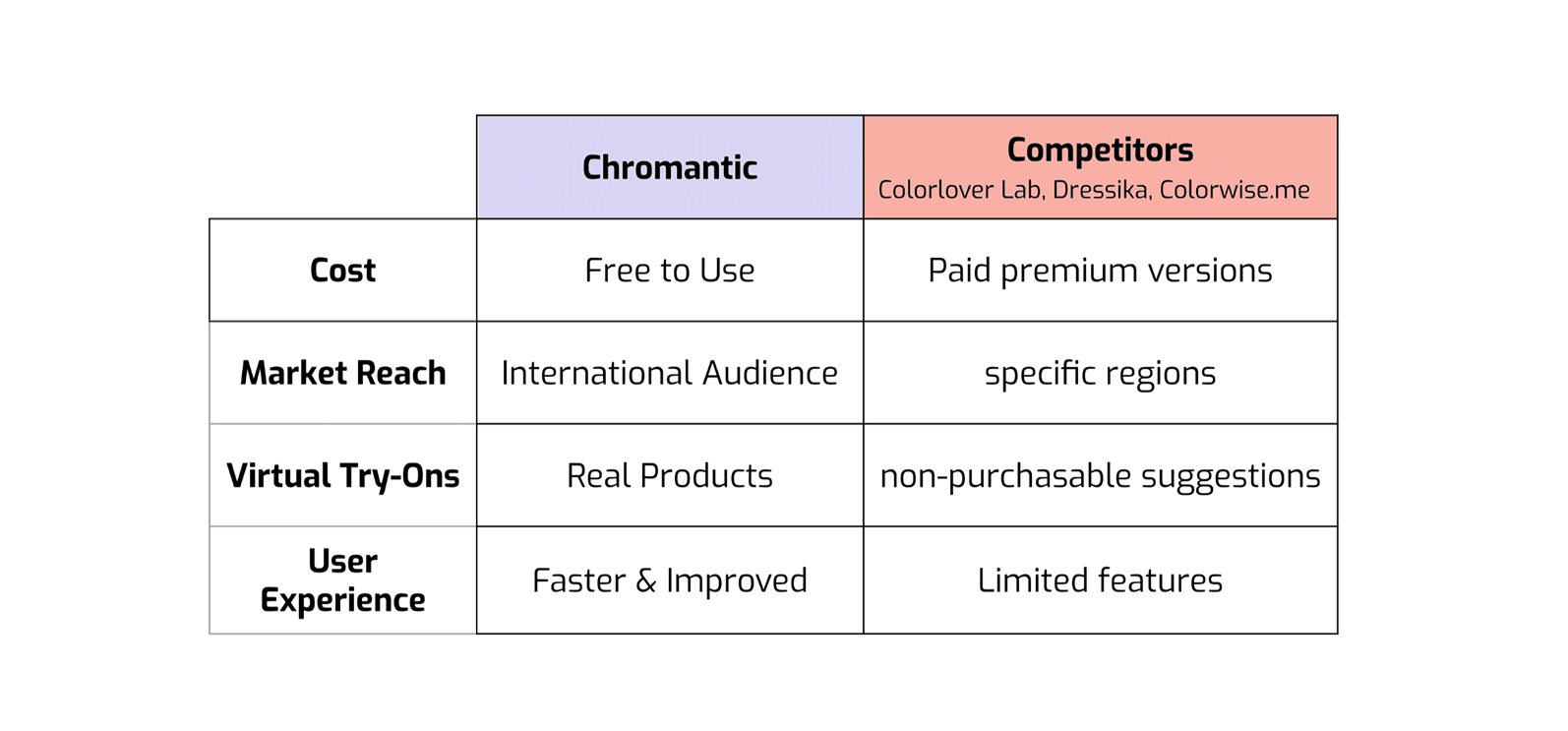
We began by researching our competitors (Colorlover Lab, Dressika, and Colorwise.me) and honing in on our unique selling points.
From there, we conducted informal surveys, online research, in-person user interviews, and review analyses to identify and compile a list of our primary stakeholders.
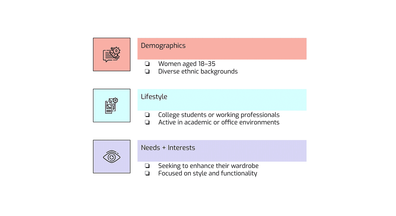
Then, we created a core user persona to represent our primary user:

Initial Design
With our key insights in hand, we began brainstorming core features that would meet both user needs and product goals and came up with the following core features, and then sketched out low-fidelity wireframes.
AI Color Analysis: Upload a photo and receive a personalized palette
Style Recommendations: Swipeable outfits and makeup products
Virtual Try-On Camera: Preview looks in real-time
Social Media Feed: Interact with other user content and share posts

Login Feature
Here, I fleshed out my login low-fidelity wireframes to high-fidelity ones, and I used our user persona "Jessica" as a sample user for the login details. For the background color, I wanted a pastel gradient (#D6D4F2, #F6C8CE) but my team suggested a vibrant purple (#952582) as our primary color to convey creativity and luxury, which I later implemented with the soft pastel colors.

AI Photo Analysis
After the user logs in, if they haven't already done so, they're directed to the AI photo analysis. For this feature, I wanted to address one of our main pain points, which is the lack of personalized recommendations.
Challenge: Users can't determine undertones without costly professional help.
Solution: Guided photo capture with lighting tips and real-time feedback.
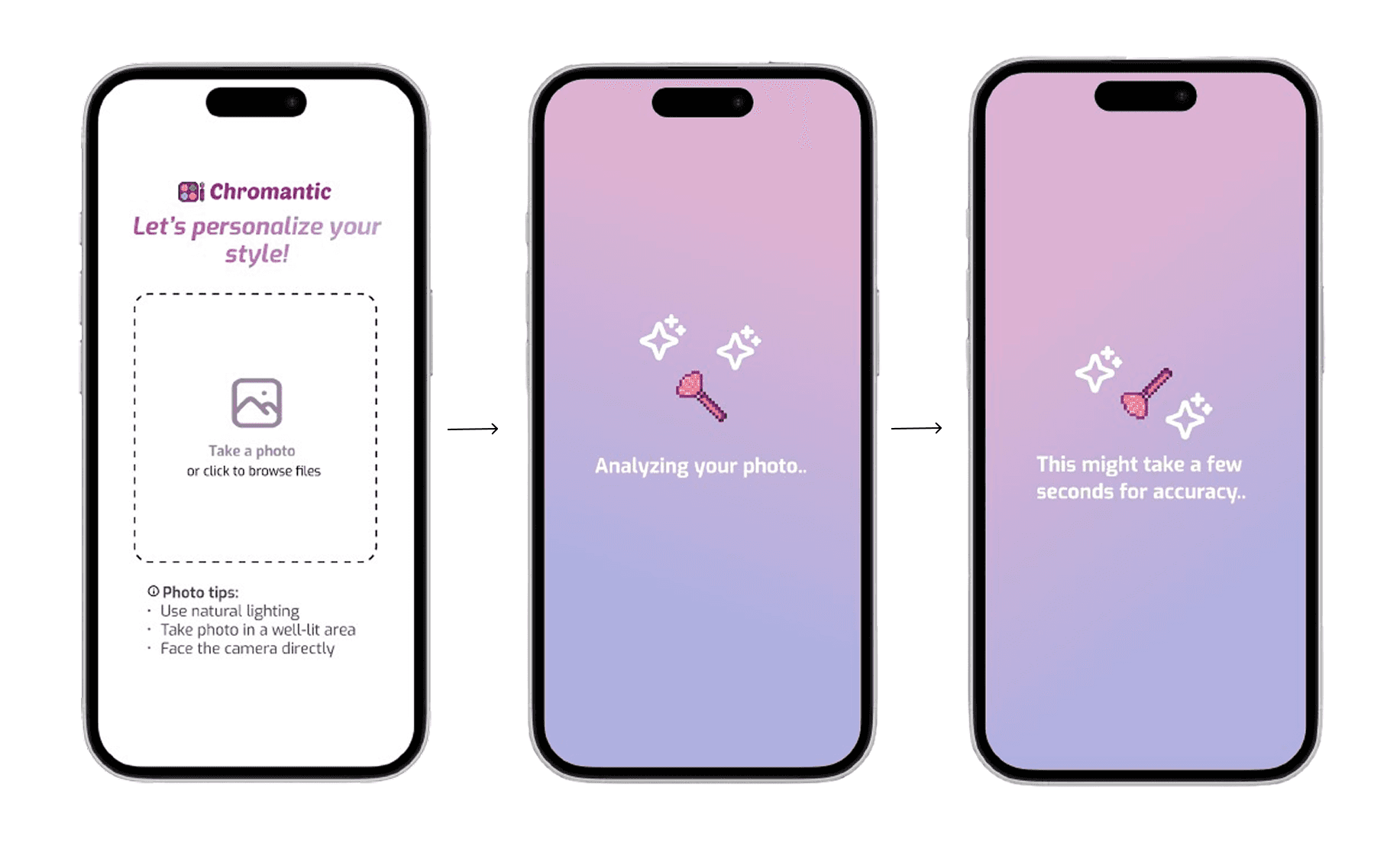
As for the user interface, I wanted make the analysis process appear as an animation — I thought it would be a fun touch!
Personalized Color Recommendations
After the AI photo analysis is done, the app shows the user's personalized color recommendations, as well as any outfits that may be compatible with the user. I noticed during user research that many women felt overwhelmed when trying to apply color theory to actual shopping decisions. Jennifer, one of the people we interviewed as part of our target demographic mentioned,
| "I know I'm a warm tone but I have no idea what that means when I'm looking at clothing and makeup."
For the Style Recommendation wireframe, I | For the Try On Cam wireframe, I |
|---|---|
|
|
|
|
|
|
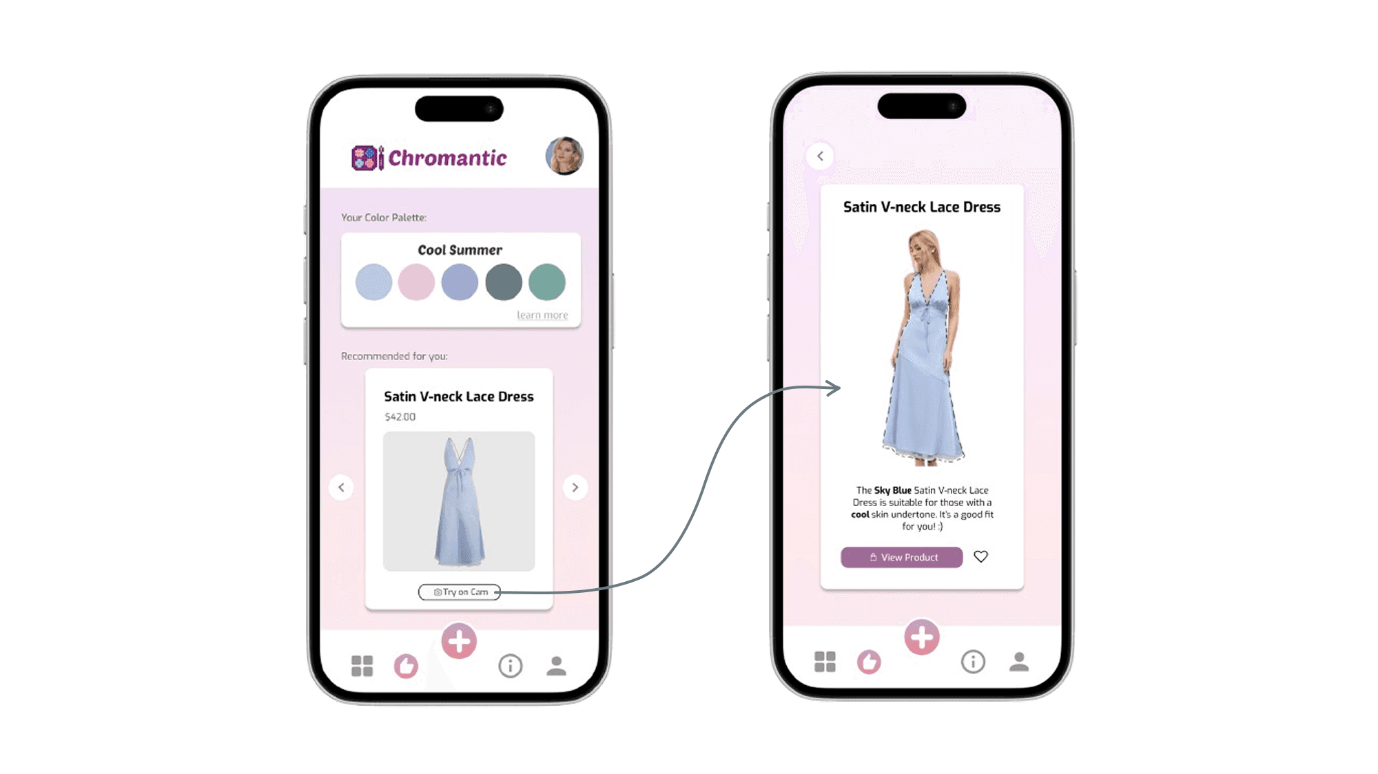
Through several rounds of testing, we found this approach significantly reduced the "analysis paralysis" that users previously experienced when trying to shop based on color analysis results.
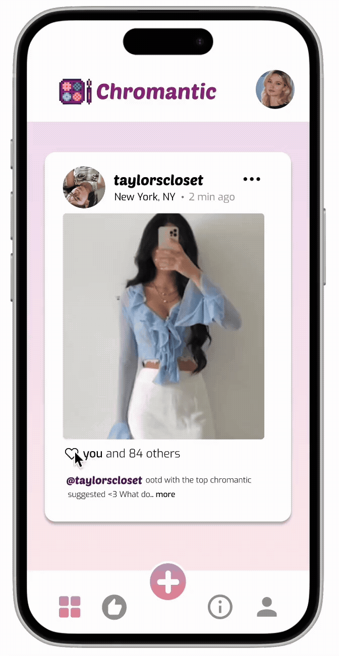
Social Media and Feed Pages
We explored ways to make style discovery more communal while avoiding becoming a full social media platform.

As we watched users interact with early prototypes, we discovered the power of lightweight engagement. Our refined social features include:
Switching between personal posts & and saved posts from other users.
Heart icons that transform from outlines to vibrant red when tapped.
Engagement counters ("you and 84 others").
Simple location tagging (Boston, MA).
Timestamp indicators ("2 min ago").
Reflections
Chromantic was more than just a design challenge—it was a mission to make color analysis accessible and empowering for everyone, regardless of skin tone or beauty background. As the sole UX designer, I had the opportunity to lead every stage of the process from research to interaction design, and make meaningful decisions rooted in empathy and intention. While it was stressful, I definitely learned and grew a lot from the experience!
This experience strengthened my belief that inclusive design is not just a feature—it’s a foundation. I’m excited to continue designing products that celebrate individuality while solving real-world challenges.